
The world's most remote micro-festival
Creative Direction
Role
Create a brand identity that conveys the adventurous and eclectic nature of the experiences
The challenge
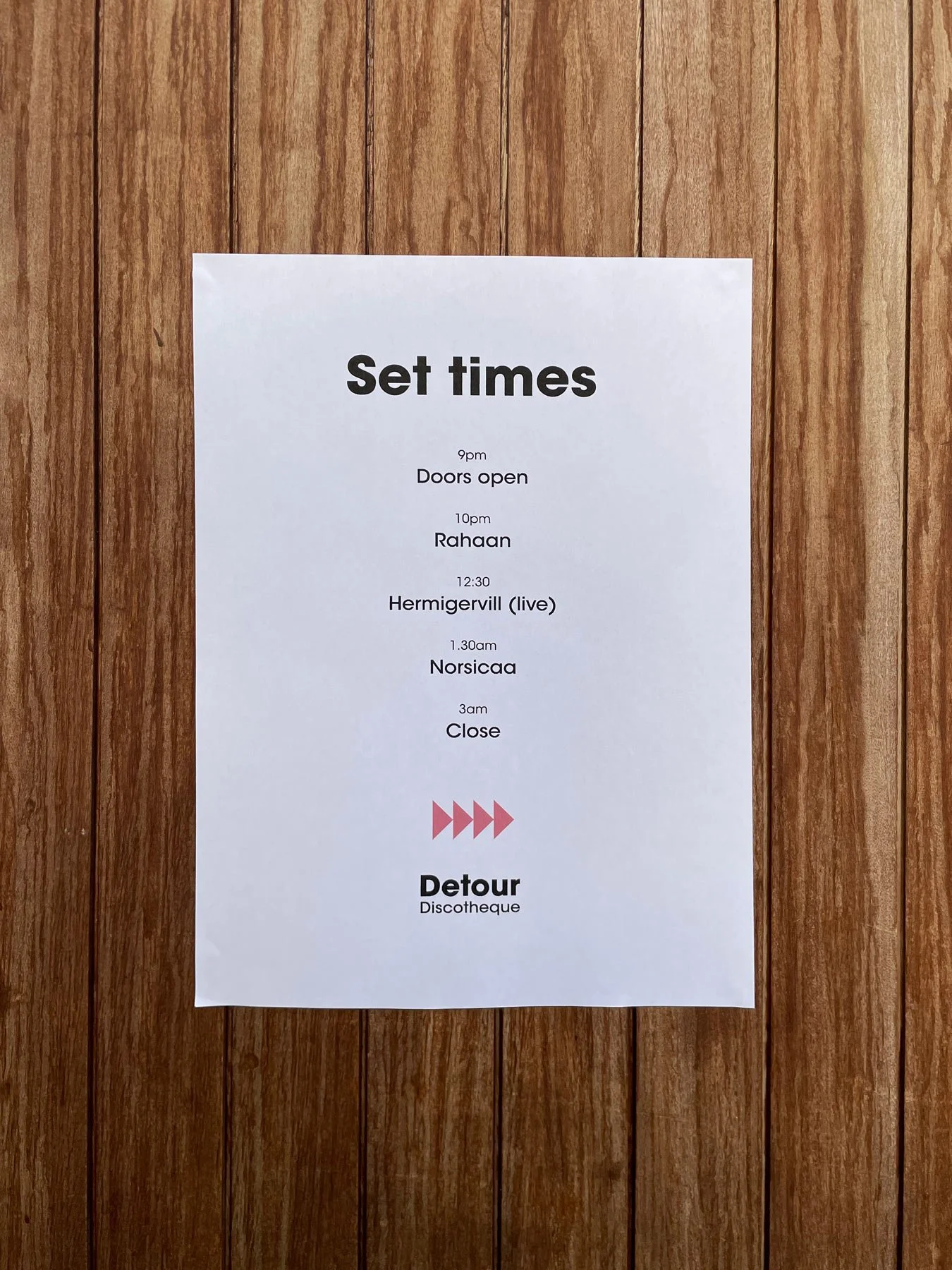
Bringing the party at the edge of the world to life with bold, record sleeve-inspired colours and classic 70s typography.
The Arrows
Celebrating the uniqueness of everyone’s journey. These core brand elements bring positive energy to all communications.
Wordmark
ITC Avant Garde Gothic is an iconic 1970s typeface and grounds the chaos of the arrows
Colours
Selected from classic loft-party classic disco covers. Reflecting the warm and vibrant tones from the era.
Photography
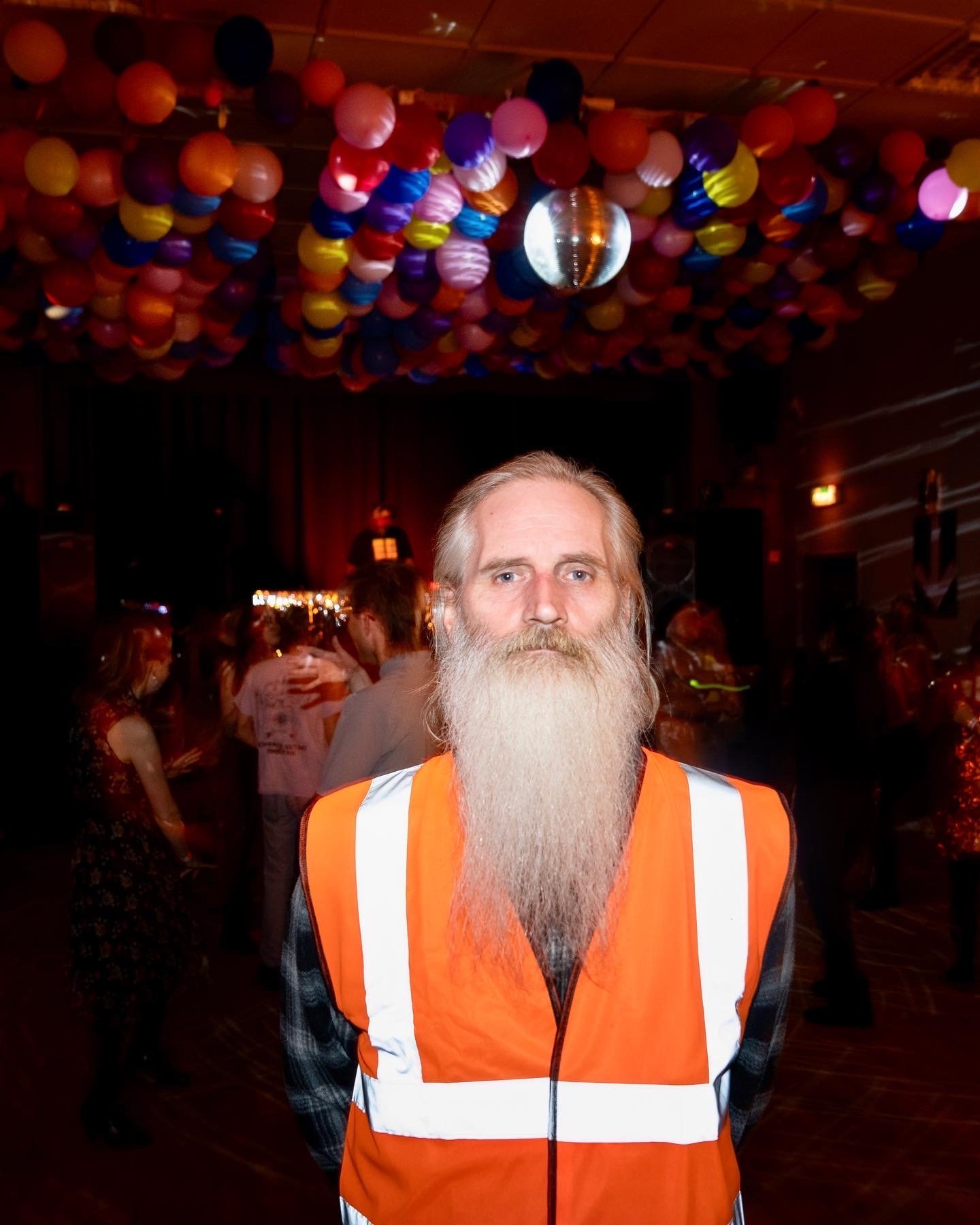
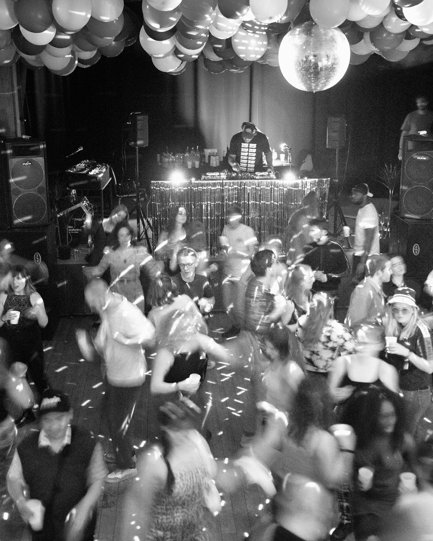
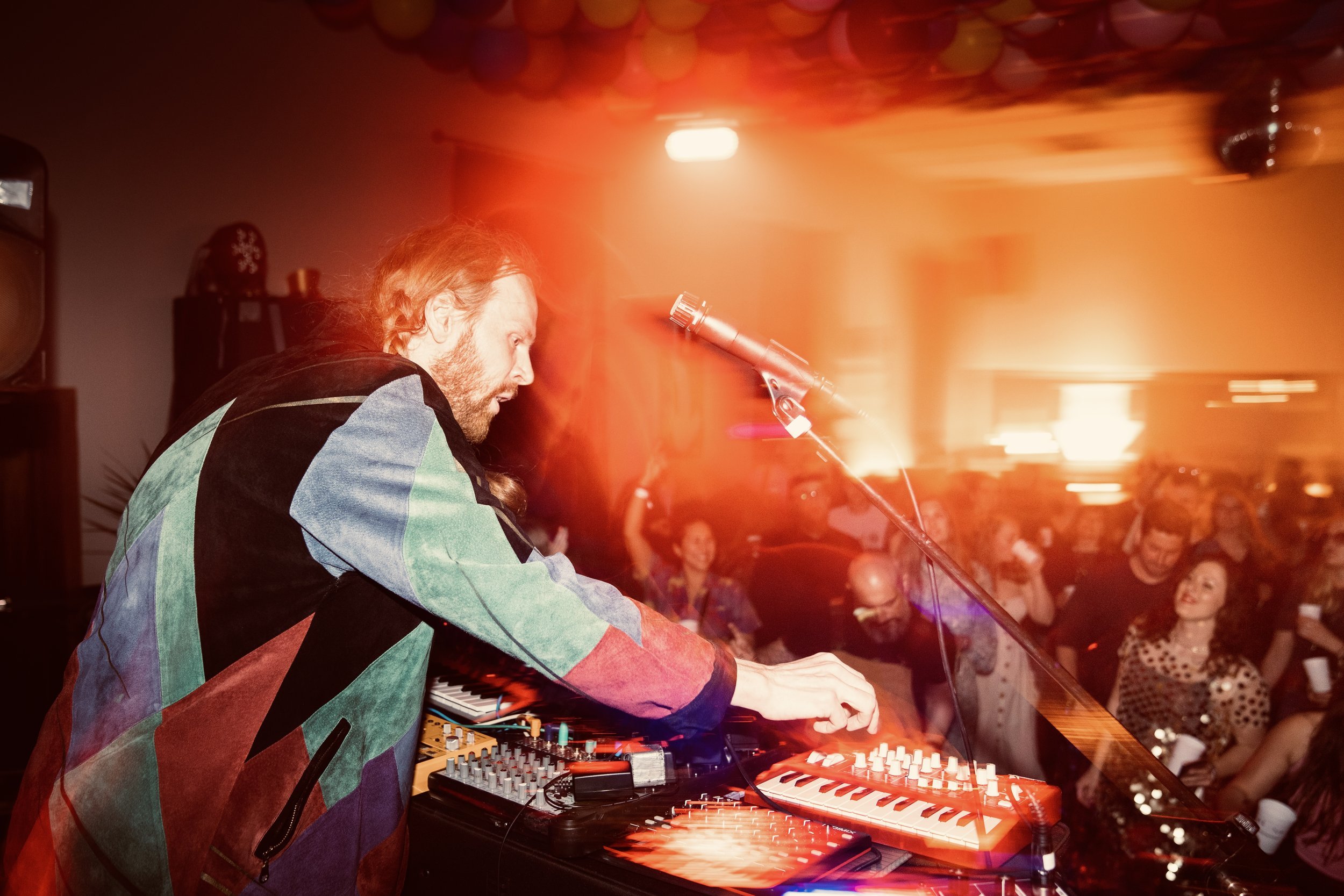
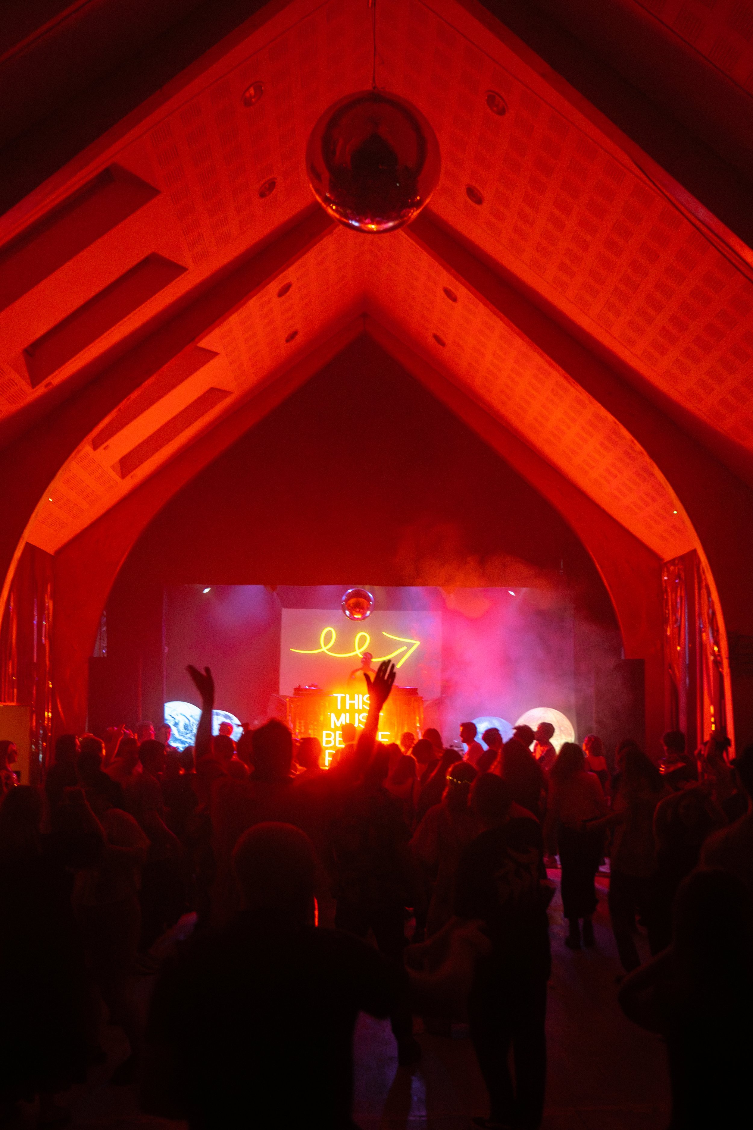
Photography is at the core of the visual language. It transports viewers and emphasises the contrast of contexts that make the event unique.




Project Feedback
Joss was able to conceptualise a brand and communications strategy that pulled together those threads, while keeping the sense of community and joy of the original disco movement. That strategy has seen us double our turnover in successive years, and his given the brand a rock-solid foundation: people understand it, are comfortable enough to make high value purchases within our digital environments and feel part of the magic once they arrive. It's also been smart and flexible enough to have carried us through the first three years of growth.
I would highly recommend Joss as a designer, storyteller and strategist.
Jonny Ensall
Editorial director and founder
Detour Discotheque

